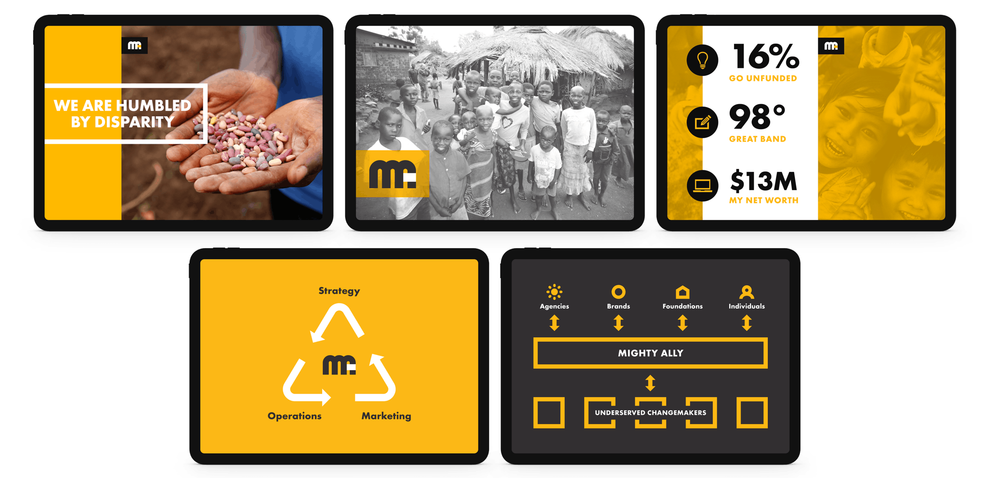
An identity for the group that brands the world’s nonprofits.
- Role
- Creative direction, project management & UX/UI
- Client
- Mighty Ally
- Tools
- Figma, Adobe CC
Summary
Mighty Ally is an agency that builds brands for nonprofits and social enterprises, most of them early-stage and working on poverty, health, and justice.
Their own brand had two jobs. It needed to look credible to the foundations and major funders their clients were chasing, and it needed to feel like it belonged to the causes behind that work.
The mark
A simple monogram.
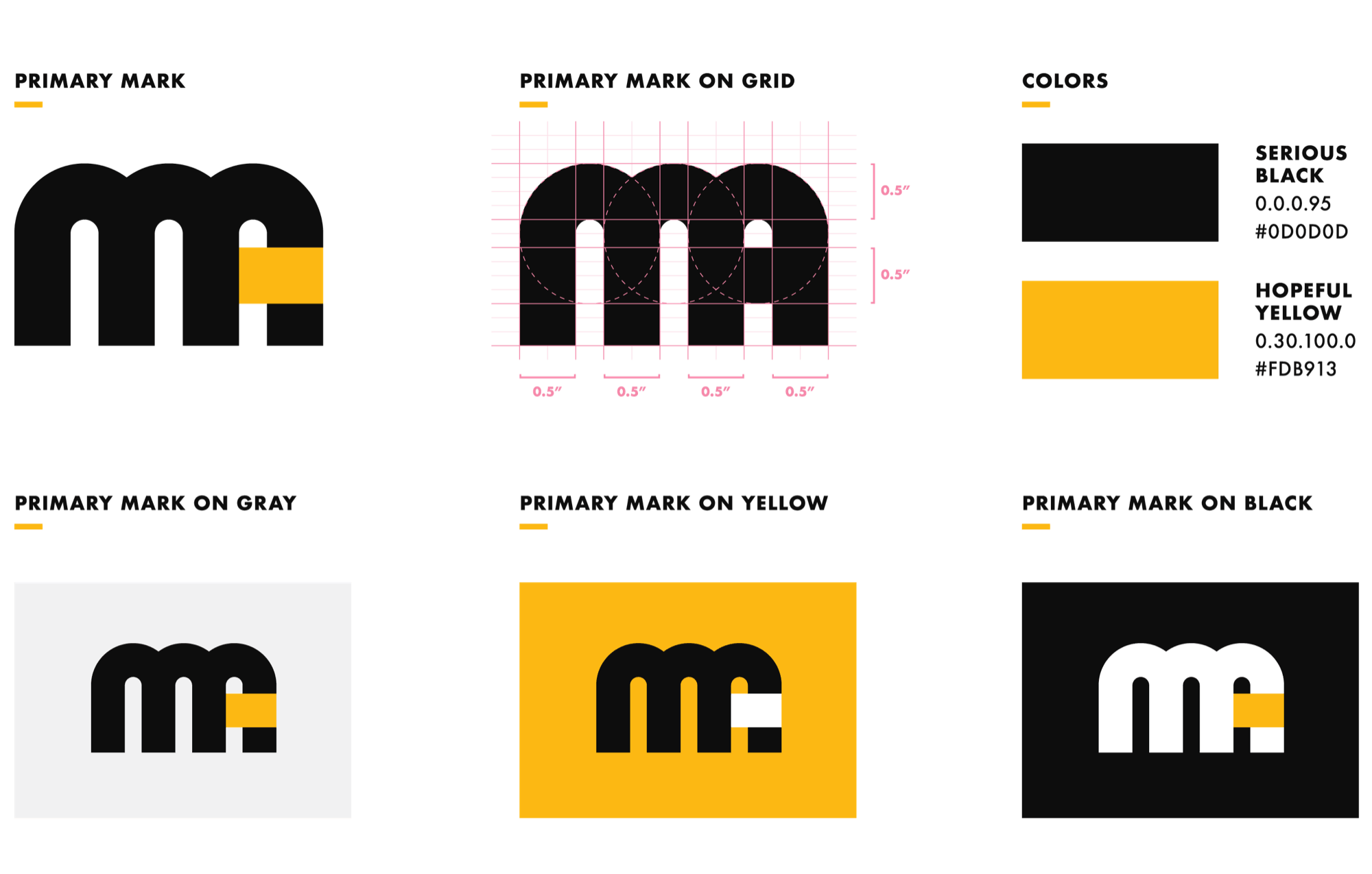
The logomark is a compact monogram built on a strict grid, two rounded strokes of the M, and an extra rounded stroke with a rectangular block of yellow that brings the A into focus. It’s geometric and modular, which allows it to scale cleanly from a favicon to a banner without losing itself.
The system
Serious Black and Hopeful Yellow.
The work Mighty Ally supports is heavy. Their clients live with disparity and injustice every day, and they keep at it because the work can actually move things. I wanted the identity to hold both the weight and the optimism, so it read as neither grim nor naive.
That thinking is made visible by the palette. I named the two core colors Serious Black and Hopeful Yellow to give the brand gravity and make it read as trustworthy without forgetting the part that believes the problem is solvable.
One system, from the page to the screen.
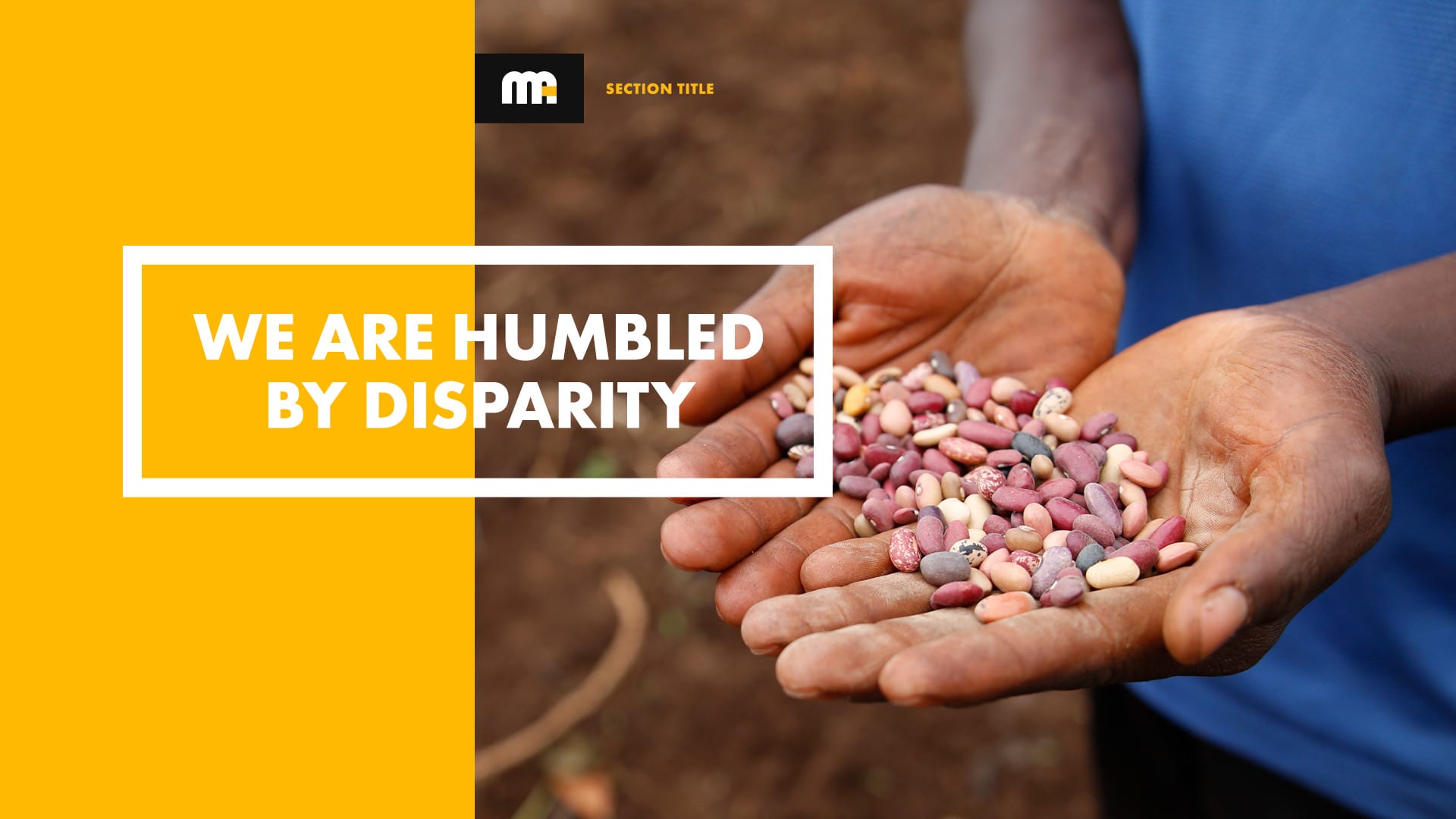
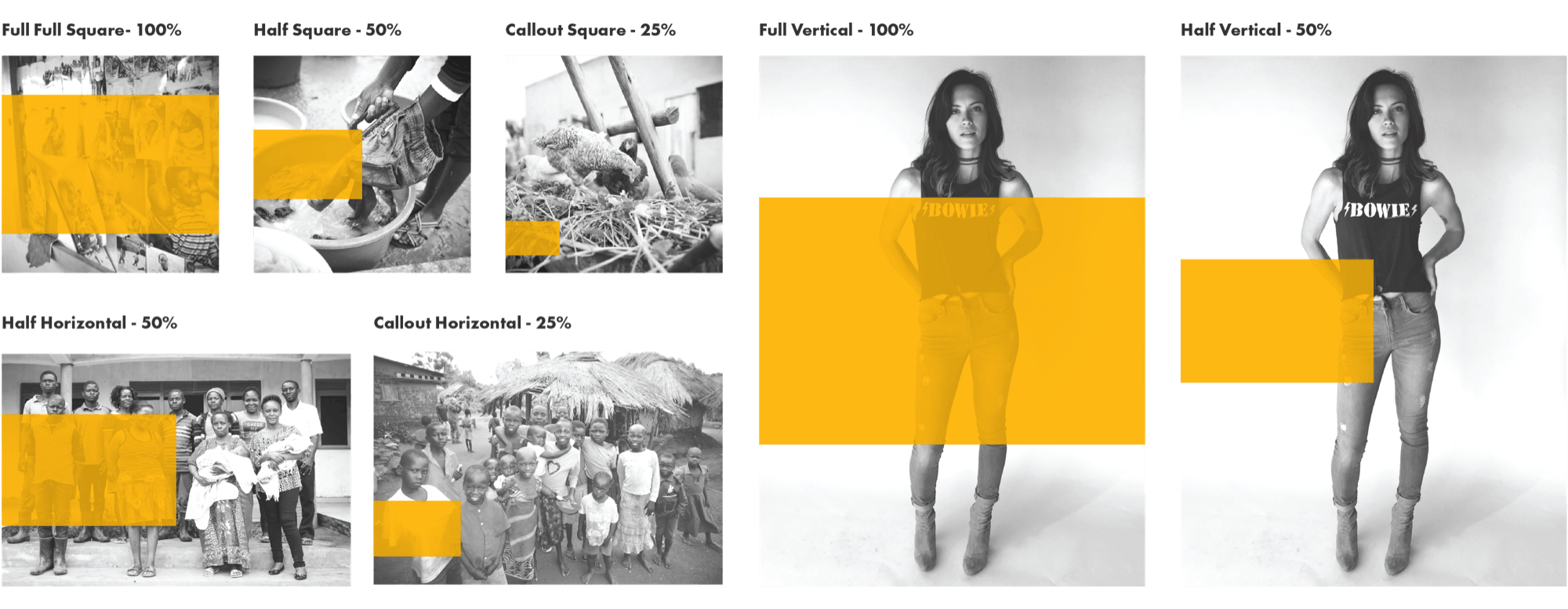
The piece that ties it together is a flag system. The yellow bar from the A lifts out of the mark and sits over photography at 100, 50, or 25 percent, scaled to the image whether it’s square, horizontal, or vertical. Every photo carries a piece of the logo without the logo having to be there.
Presentation